Microsoft Visio 101: Additional tips
This post closes the Microsoft Visio 101 series after an introduction to the tools, and a focus on positioning and aligning shapes.
For this one I don’t have a specific topic, but I have remaining tips to share 😊
Find your own style
As a backend developer/architect, making diagrams is one of my few opportunities to make something nice-looking in my professional life. So over the years I have tried to improve my diagrams to give them a personal style with very simple tweaks, starting with connectors.
Let’s start with this few shapes linked together:
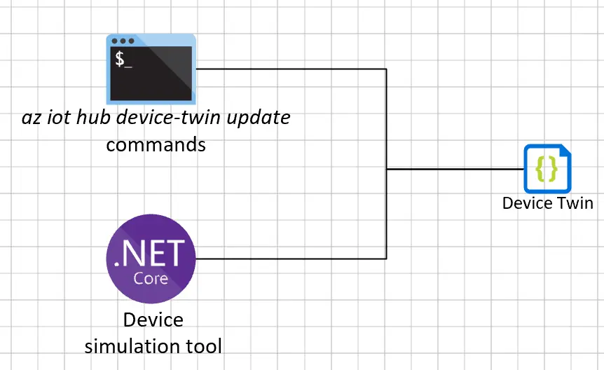
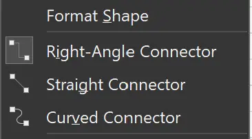
The alignment and positioning looks good, but the connectors with the default settings give a raw, unfinished feeling. The contextual menu can open the Format Shape panel and set the connector style between right-angle, straight and curved:
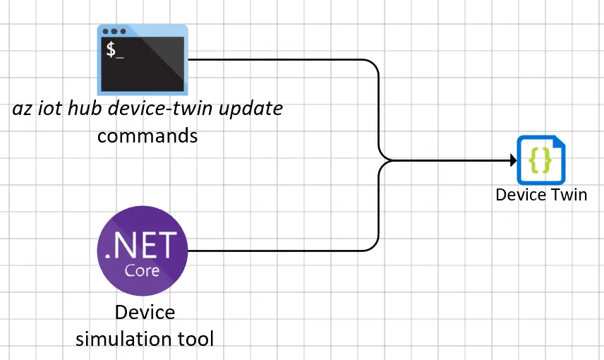
The curved style is great for softening the angles, but it’s not easy to work with so I stick with the right-angle style all the time. It’s much easier to get something symmetric, and to soften the angles I increase the rounding size in the format shape panel to 3mm. I also increase the width to 1pt and choose an end arrow type (I like the 02).
These 3 little changes are my go-to style for connectors, and make the diagram look much better:
I haven’t found a way to set this as the default style for connectors, so I set it once on a connector and use the Ctrl+Shift+P shortcut to apply it quickly on other connectors.
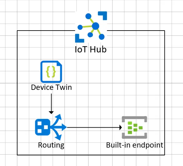
Another thing I like to do is putting shapes in the same “box” when they’re related in some way. For instance Azure resources in the same resource group or domain, or to break down the underlying features of a resource, like this IoT Hub for example:
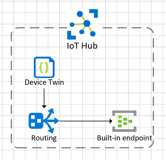
By setting the transparency to 50%, increasing the width to 1.5pt, choosing a dash type and setting the rounding size to 3mm, all from the format shape panel, it’s more stylish:
These are just a few changes I do all the time to improve my diagrams, I encourage you to experiment with the format shape panel, find your style and give your diagram a personal touch.
Use the text background feature
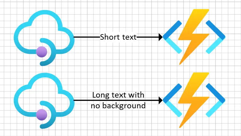
Adding text to a connector can be made in different ways, depending on the length of the text and the connector. When the text is shorter than the connector, I like to place the text on top of the connector. But when there is too little room the text would hide the connector so I prefer to split it and keep its background transparent.
You can see the difference here:
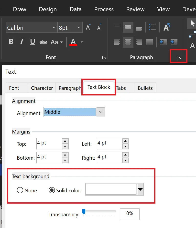
This is done by selecting the connector, and setting the text background from either None or Solid color to white. Open the Paragraph dialog, Text block pane, and finally Text background:
Very simple tip but very handy as well, so worth sharing at the end I think.
Sync you favorite shapes using git
This last one is a trick I have been using for many years to synchronize my Visio shapes from various sources using git. I have made a dedicated post a few weeks ago so you can check it out.
Wrapping up
This is the end of Microsoft Visio 101 series, at least for now, I might edit this post later if I have more ideas. I hope these posts will help you to improve your diagrams, and that you will enjoy doing diagrams as much as I do.
Happy drawing ! 🤓